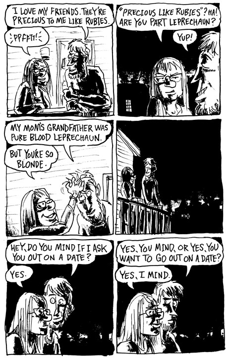
I should have the rest of the book done soon, since it's only eighteen pages. In keeping with the idea that rough sketches always looking the better that something I obsessively labored over, it was inked over very loose pencils with on corrections. I may go back and fill in some blacks or white out a line or two that bothers me, but for now I'm kind of happy with it.
Subscribe to:
Post Comments (Atom)


Quentin Blake (the English childrens' book illustrator) spends quite a while on his pencils then flies over them with the pen - at the approximate speed of handwriting - to get that same relaxed look you manage to get on these. He was also a lecturer so he passed it on as a technique to many of his students (Steven Appleby for example.)
ReplyDeleteThe facial expressions are great.
How do you achieve that slightly distressed black? Is it with a dryish brush on a rough surfaced paper?
PS- loved the last comic.
ReplyDeleteI'm using a thicker paper than I was on my previous comics, so I think I'll be getting some better brush strokes in this newer story. The distressed look is from the last bits of wet ink on the brush, usually done with older brushes that are worn out. It's all scanned in at high res bitmap. I was influenced by Rich Tommaso's comics. He has a great technique with his inking style.
ReplyDeletehttp://richtommaso.com/